SMARTASSET
Savings Rate Table Redesign
Increased click-through-rate by 35% by redesigning a feature that helps consumers compare offers from various banks
TEAM
Sarah T. (Self), Product Designer
Kyrsten G., UX Researcher
Vishal D., Product Manager
Pavel M., Front-End Developer
TIMELINE
June 2022
Launched in April 2023
SKILLS
UX Research
UX Design
UI Design
TOOLS
Figma
Jira
The Overview
SmartAsset seeks to empower people to make smart financial decisions through their accessible personal finance articles, personalized calculators, and educational tools.
This case study will focus on my process in redesigning one of SmartAsset's most popular tool, the Savings Rate Table, which aims to help users learn more about the available savings accounts and increase click-through-rates to our bank partners.
PROBLEM
The Need
How might we help users compare and evaluate various savings accounts?
FEATURE PREVIEW
A Quick Look
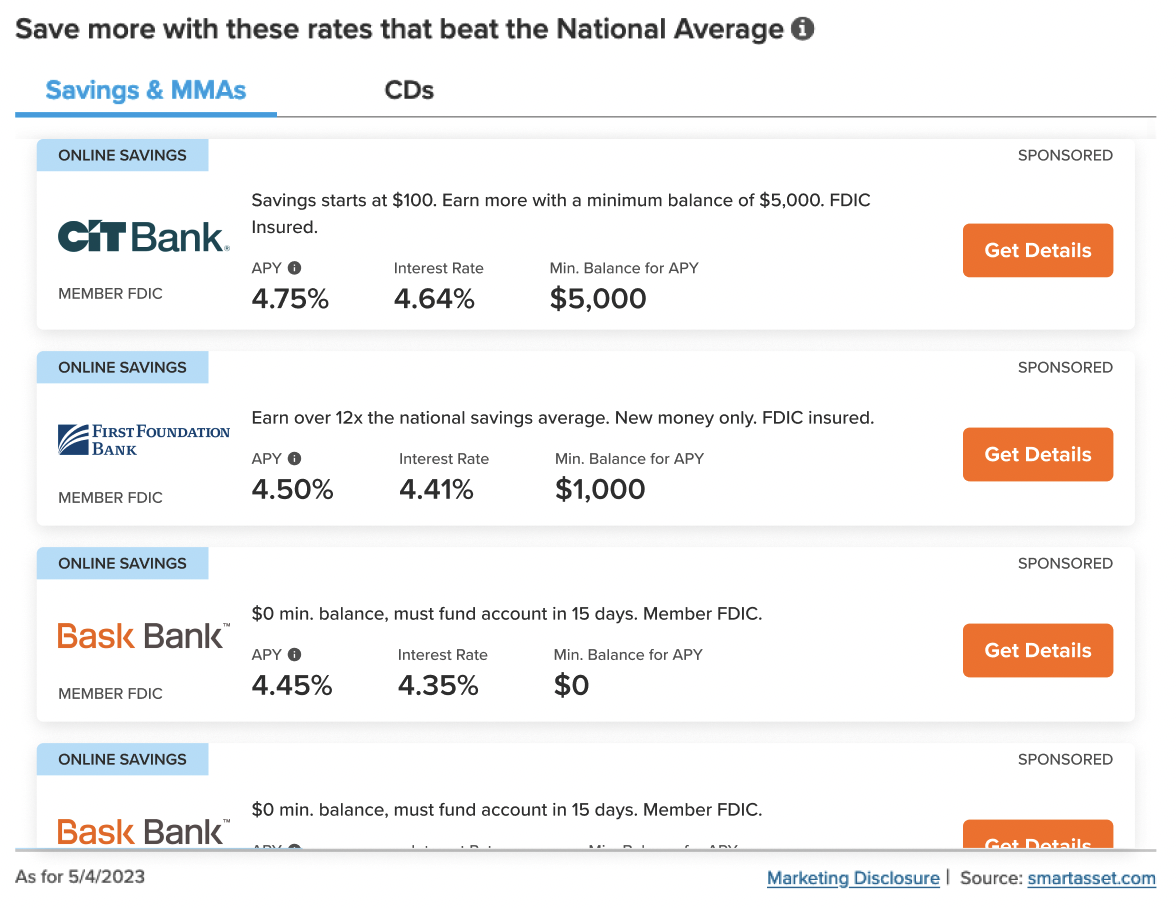
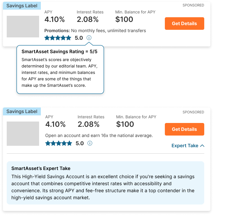
The redesigned savings rate table offers an intuitive structure, highlights key bank stats, and features a prominent CTA button for easy learning and comparison of savings accounts.
Original (left) and Redesign (right)
Now, let's talk process!
USER RESEARCH
Understanding Savers
Empathizing with the User
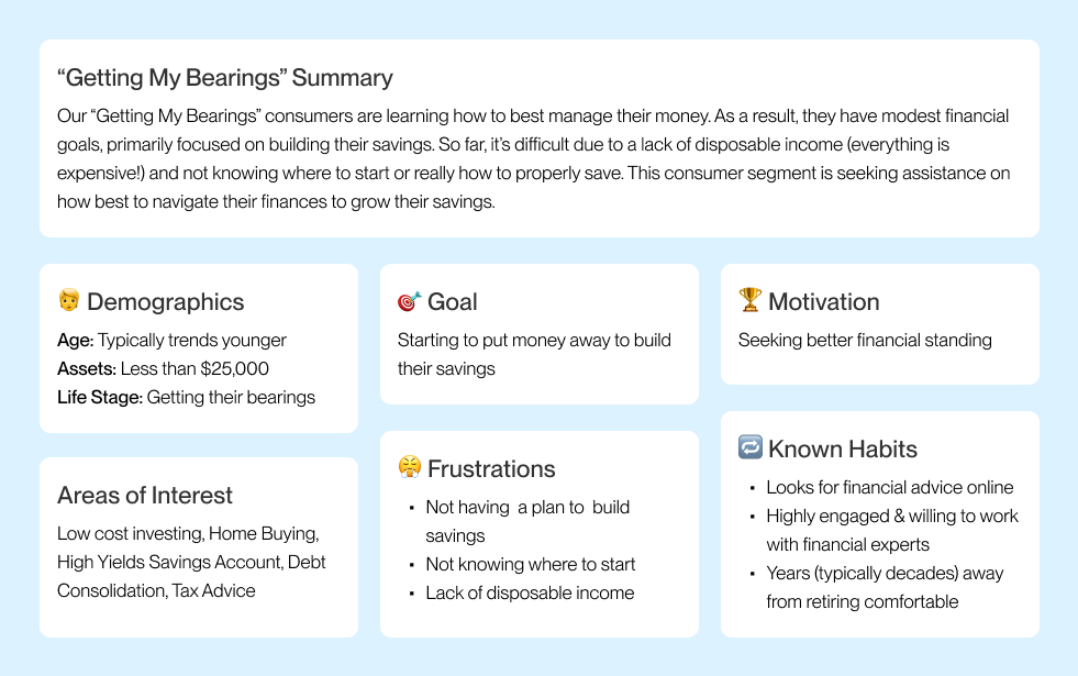
To kickstart the design process, I began by pouring over insights gleaned from previous user interviews of our main consumer groups for our savings products. Within SmartAsset, our consumer base comprises of two distinct groups: pre-retiree individuals and those in the "Getting My Bearings" phase of their personal finance journey. For this project, I focused in on the "Getting My Bearings" consumer, specifically their goals, motivations, frustrations, and habits.
Analyzing the Competitive Landscape
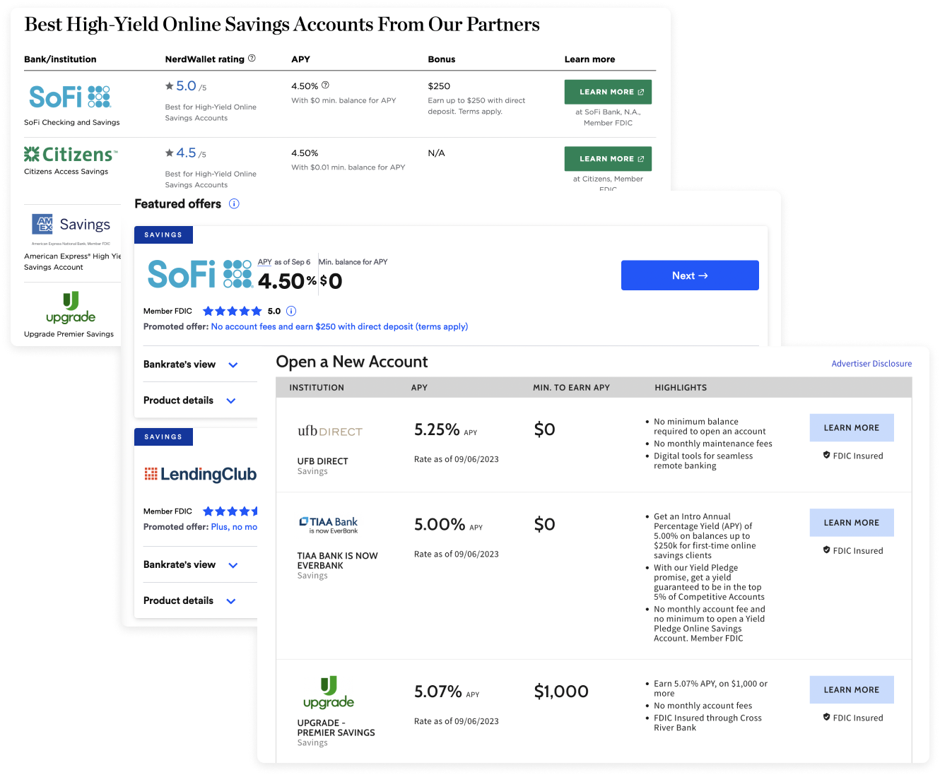
Afterwards, I scoped out how other fintech companies approached savings rate tables. I noted how they organized information and how they structured various elements.
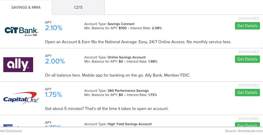
Auditing Previous Designs
After conducting my competitive analysis, I dove straight into a thorough UX audit of the original savings rate table design. I wrote down any improvements to the table's usability, information hierarchy, and navigation. Comparing my recommendations to the project goals outlined by my PM, I distilled my notes to three primary areas of improvement:
01.
Strengthen visual hierarchy and readability to ensure users can easily identify and understand key details
02.
Increase button prominence to make the CTA more noticeable and encourage users to learn more.
03.
Optimize mobile navigation to meet mobile-first guidelines and reduce friction.
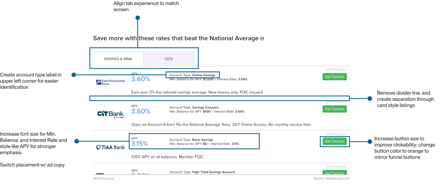
Desktop Audit (left) and Mobile Audit (right)
Apart from usability, the user interface does not align with SmartAsset's updated style guide, which may pose a challenge for future design projects in terms of creating a cohesive brand identity, trust with users, and aesthetic-usability reputation.
CHALLENGES
Creativity Within Confines
This project was not without its challenges, the main one being the tight deadline and design constraints. Before jumping into my design exploration, it was extremely important to understand the project requirements and constraints. Doing so helps me foster the creativity needed to make this project successful. The main requirements and constraints were as follows:
Requirements
01.
Optimize for mobile devices
02.
Show same # of listings in default view
03.
Include tooltip for APY
Constraints
01.
Maintain current table functionalities
02.
Cannot add new features
03.
Keep current copy
DESIGN EXPLORATION
Re-Imagining the Architecture of the Savings Rate Table
I began my design exploration by gathering inspiration from various sources: successful designs from SmartAsset's product suite, competitive research, and feedback from my product and design team. It was important for narrow down my ideas based on which ones successfully organized information and helped users in evaluating different savings accounts. Below chronicles my exploration and thought process.
EXPLORATION NO. 1
Incorporating Successful Design Patterns
To align the redesigned savings rate table with the rest of SmartAsset's product suite, I pulled design elements from successful tests. This includes utilizing light blue and orange as accents and integrating the tab navigation and card UI motifs that performed well.
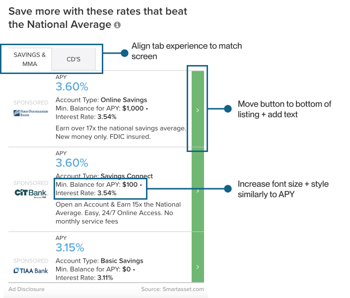
EXPLORATION NO. 1.5
Refining the Visual Hierarchy
Nailing the order of elements was crucial for enabling users to quickly scan the bank details in the listing. I experimented with font weight, size, and element order to establish a logical and organized flow within the listings.
EXPLORATION NO. 2
Blue Skies Dreaming
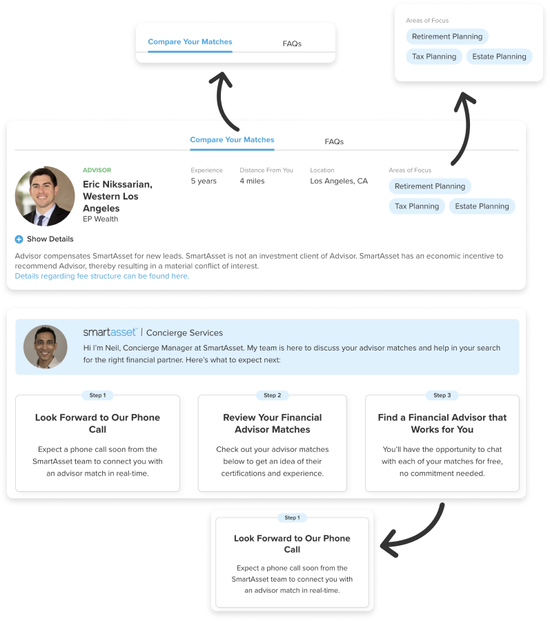
Although this technically falls outside the project scope, I felt it was worthwhile to explore what additional elements (such as customer reviews and expert takes) I could add to aid users in evaluating and selecting the best savings account for their needs.
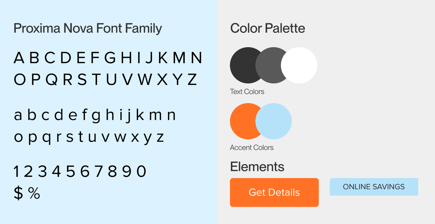
BRANDING
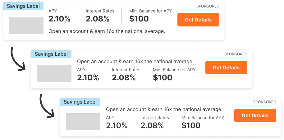
Less is More
Though the listings on the original savings rate table make great use of space, the text size and weight could make reading difficult for vision impaired users. Furthermore, the way colors were incorporated and the overall layout still made the table feel flat and unengaging.
To rectify this, I created a visual identity that utilized more white space to create a light and airy feel. I also utilized larger font sizes and different text weights to strengthen the visual hierachy. Lastly, I incorporated accent colors that could evoke the SmartAsset brand for users and make the call-to-action pop.
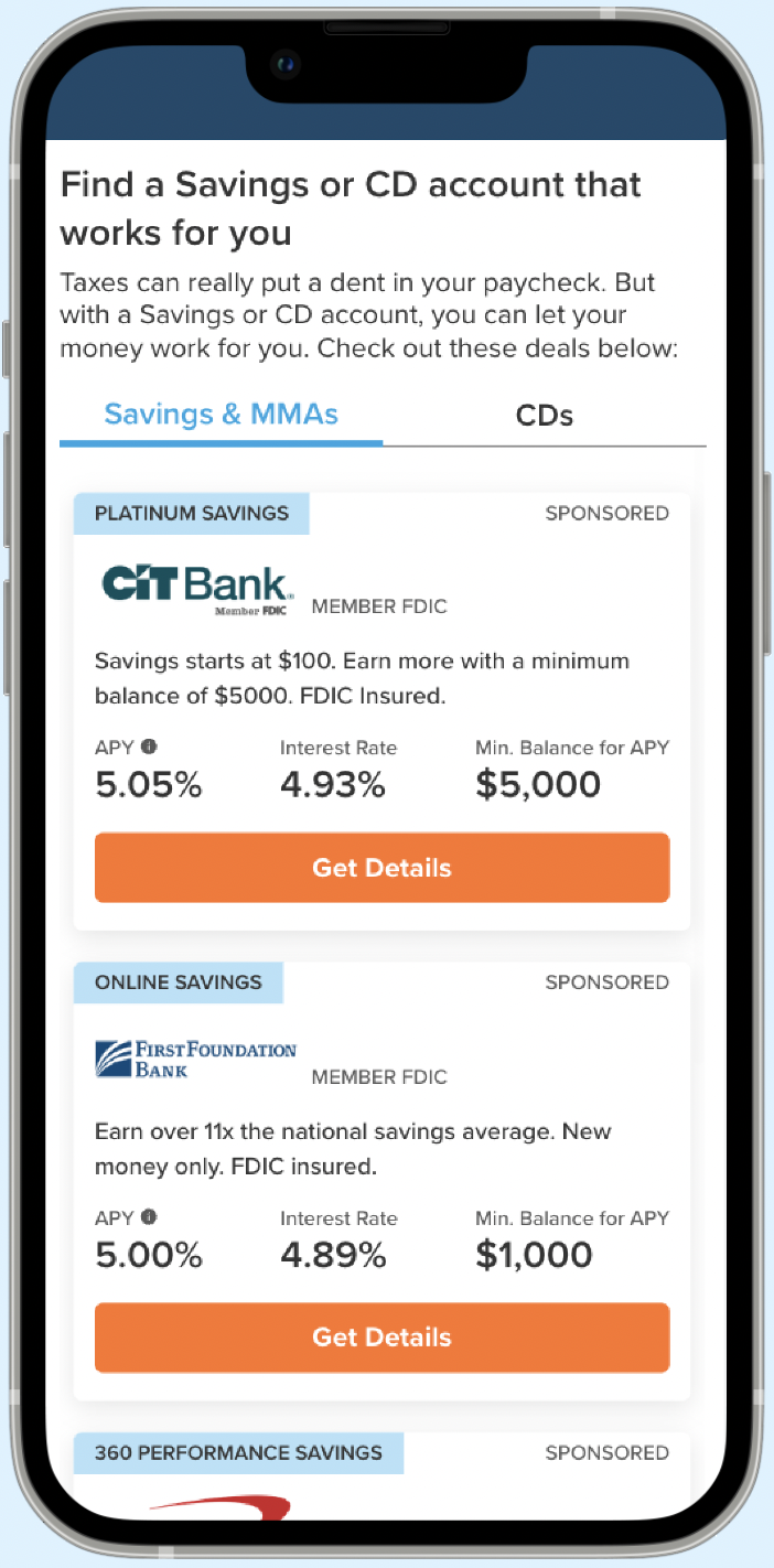
FINAL
The Final Deliverable
Desktop View
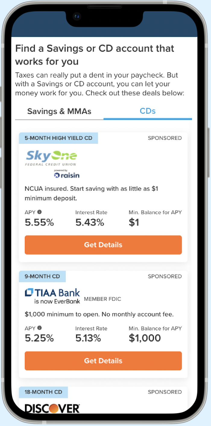
Mobile View
RESULTS
Big and Little Wins!
With limited research resources and time, we opted to do a live release A/B test. I worked closely with my PM and UX researcher to monitor the performance of the redesign, click-through-rates, and any incoming feedback from our users and bank partners. The implemented changes yielded significant results, showcasing the effectiveness of the redesign. Here are some notable achievements:
35%
in increased click-through-rate
month over month
$15K
in monthly revenue uplift
20+
pages where the table is featured
REFLECTION
Key Learnings
Although the redesigned savings rate table exceeded our goal, it definitely had its challenges especially during the developer-handoff phase. Initially, inconsistencies in the rendering caused the table to appear compressed on some pages and normal on others. When addressing this issue, there were inefficiencies in the overall communication and review process. To ensure future handoffs run smoothly, we established these new practices:
Identify Breakpoint Specifications
With features like the savings rate table, it is extremely important to capture every page the feature will appear on. For the first release, I only captured a portion of pages where this table would be and its breakpoints. To ensure proper designs for each use case, I will capture all these pages where the feature will appear and inspect each page "type" by notating the container widths. Additionally, I will adjust the font size and spacing to ensure a consistent look across the board.
Specify Acceptance Criteria
While I know my designs like the back of my hand, that doesn’t mean my developers and QA engineers do. Taking the time to ask them about their specific communication needs allows me to communicate requirements more effectively which enables easier coding and issue identification.
Build In Additional Review Checkpoints
To ensure successful releases, I added reviews during the development process and collaborated with QA engineers. By reviewing designs alongside them, we can promptly identify and address issues that arise.
Let's get in touch!