SMARTASSET
SmartAdvisor
Responsive web page redesign for an online marketplace connecting financial advisors to high-intent investors
TEAM
Karen W., VP of Advisor Marketing
Kyrsten G., UX Researcher
TIMELINE
October 2022 (2 Weeks)
ROLE
UX/UI Design
Art Direction
TOOLS
Figma
The Overview
SmartAdvisor, an arm of SmartAsset, assists financial advisors in converting prospects into clients using multi-channel, content-driven marketing.
This case study covers my process for redesigning the SmartAdvisor about page to increase advisor signups and engage prospective advisors.
PROBLEM
The Need
How might we build trust with prospective advisors who are skeptical about signing up?
PAGE PREVIEW
A Sneak Peek
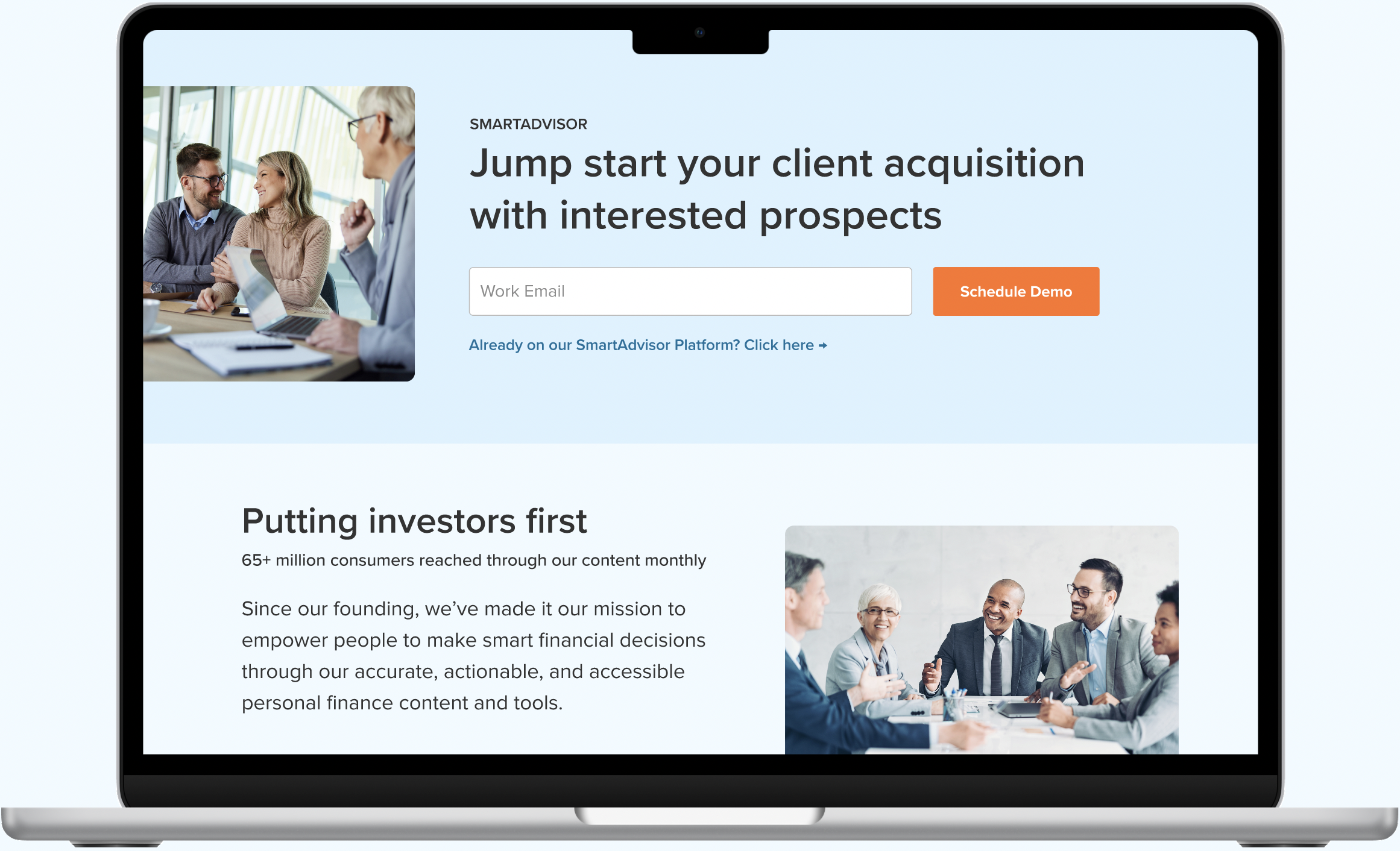
A one-stop shop for financial advisors looking to gain more clients and valuable insights on how they can improve their advisory business. Here's a preview of the core changes made to the SmartAdvisor about page. Scroll down more a more in-depth look at the process.

Streamline Signups
By placing the signup form on the same page, rather than opening it in a new tab, users are encouraged to complete the form while SmartAdvisor is top-of-mind, reducing friction in the process.
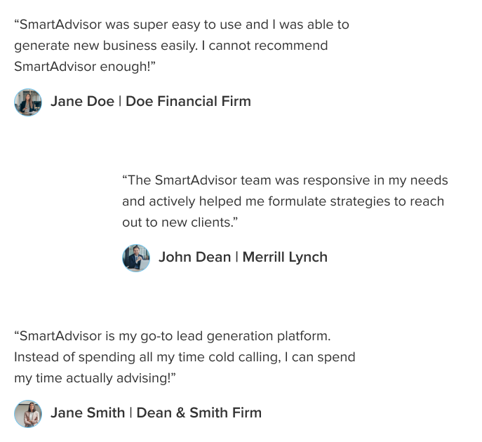
Highlighting Impact & Credibility
Through user testimonials from existing financial advisors on our platform and relevant investor engagement stats, we're able to validate our claims and build confidence in our services.
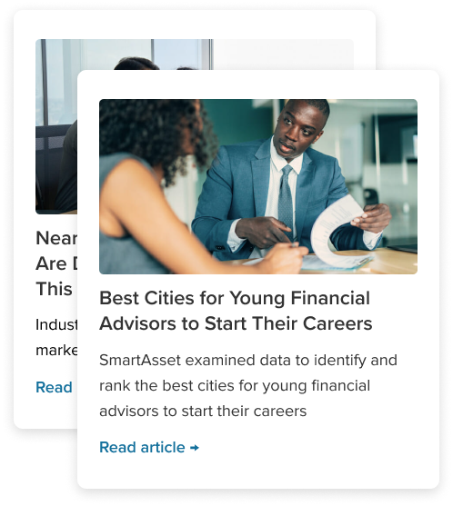
Free and Accessible Resources
New “Resources” and Advisor Newsletter sections are added to provide value to prospective advisors at no cost. This showcases our expertise while creating opportunities to engage with our platform in a low stakes way.
Now, let's talk process!
KICKOFF
Defining Project Goals
To kickoff this project, I first met with Karen W., the VP of Advisor Marketing to get a better understanding on the current state of SmartAdvisor and what her blue skies vision was for the program. Through this conversation, I was able to pinpoint both short and long-term goals that would guide me through my design process.
Short Term Goals
01.
Increase # of advisor signups
02.
Create free ways for advisors to engage with SmartAdvisor
Long Term Goals
01.
Create a hub where current and prospective advisors can improve their advisory business and grow their professional network.
USER RESEARCH
Understanding Financial Advisors
Empathizing with the User
Since it was difficult to interview existing financial advisors on our platform on such short notice, I did the next best thing: immerse myself in all related to financial advisors. I pored over articles, studied our previous UX research, and had conversations with SmartAdvisor account managers to really get a sense of what advisors need and struggle with in their advisory practices. Here are the main challenges advisors face:
Auditing Previous Designs
Following my user research, I conducted a UX audit of the current SmartAdvisor about page. The goal of the audit was the identify areas of improvement through the lens of how effective this page was at attracting new advisors to the program. Here are three areas of improvement I will focus on for the redesign:
01.
Reduce signup friction by placing the signup form on the same page
02.
Utilize more visuals to balance content. This helps to reduce information overload and increasing user engagement.
03.
Increase social proof to build trust with advisors and aid in the service evaluation process.
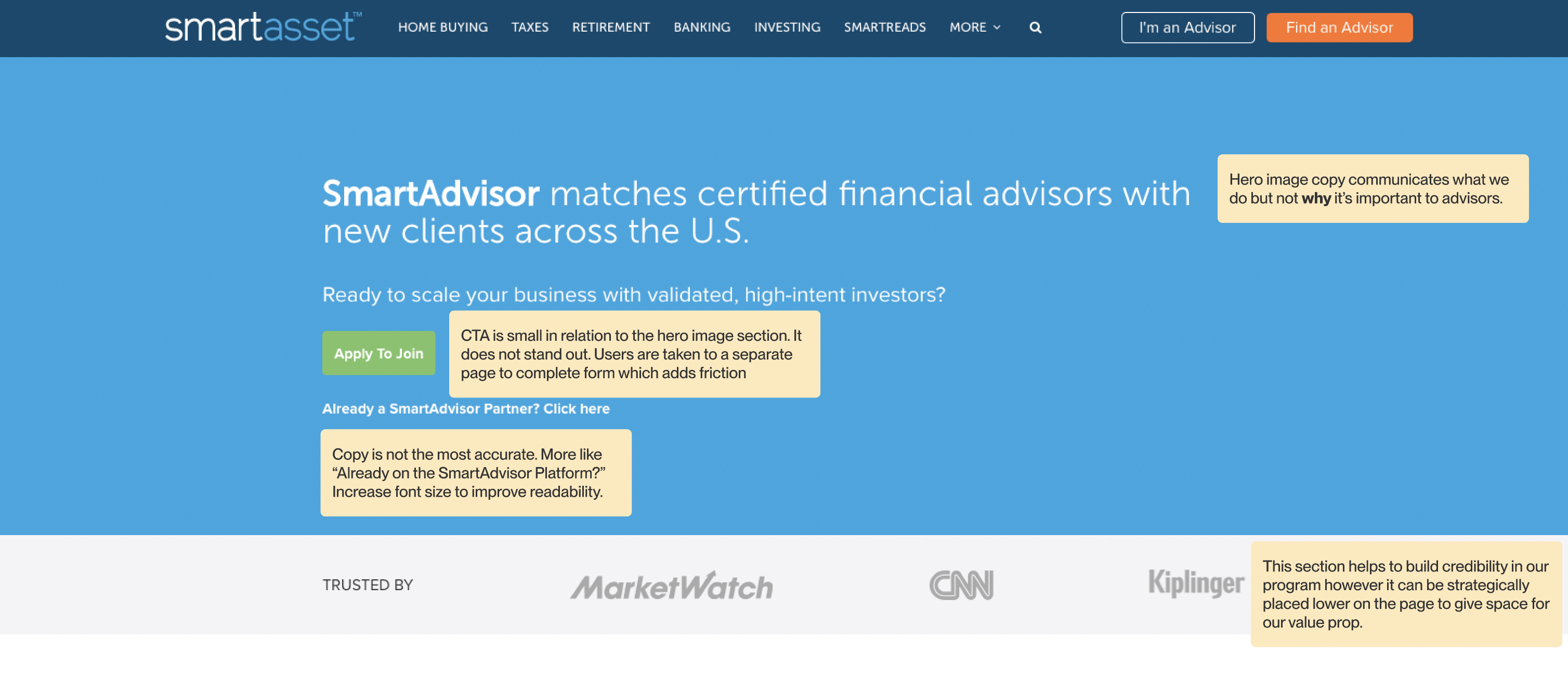
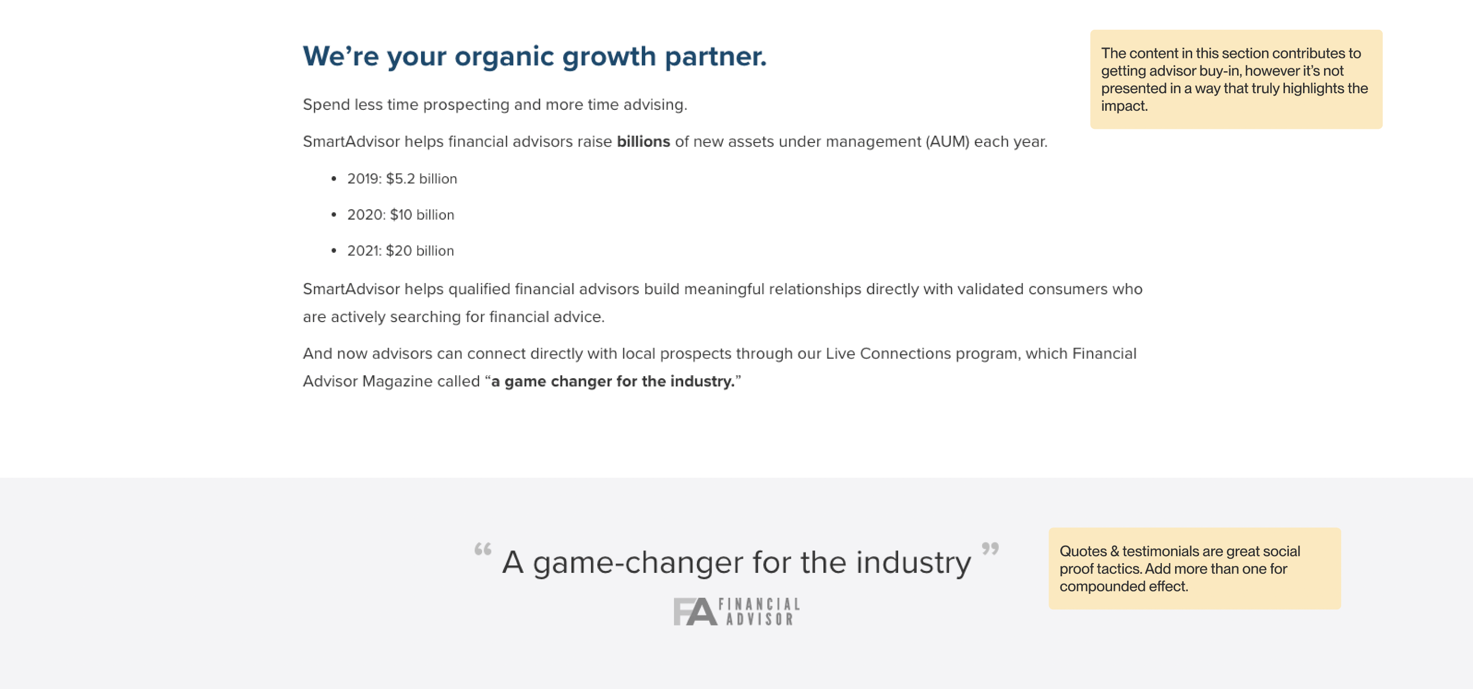
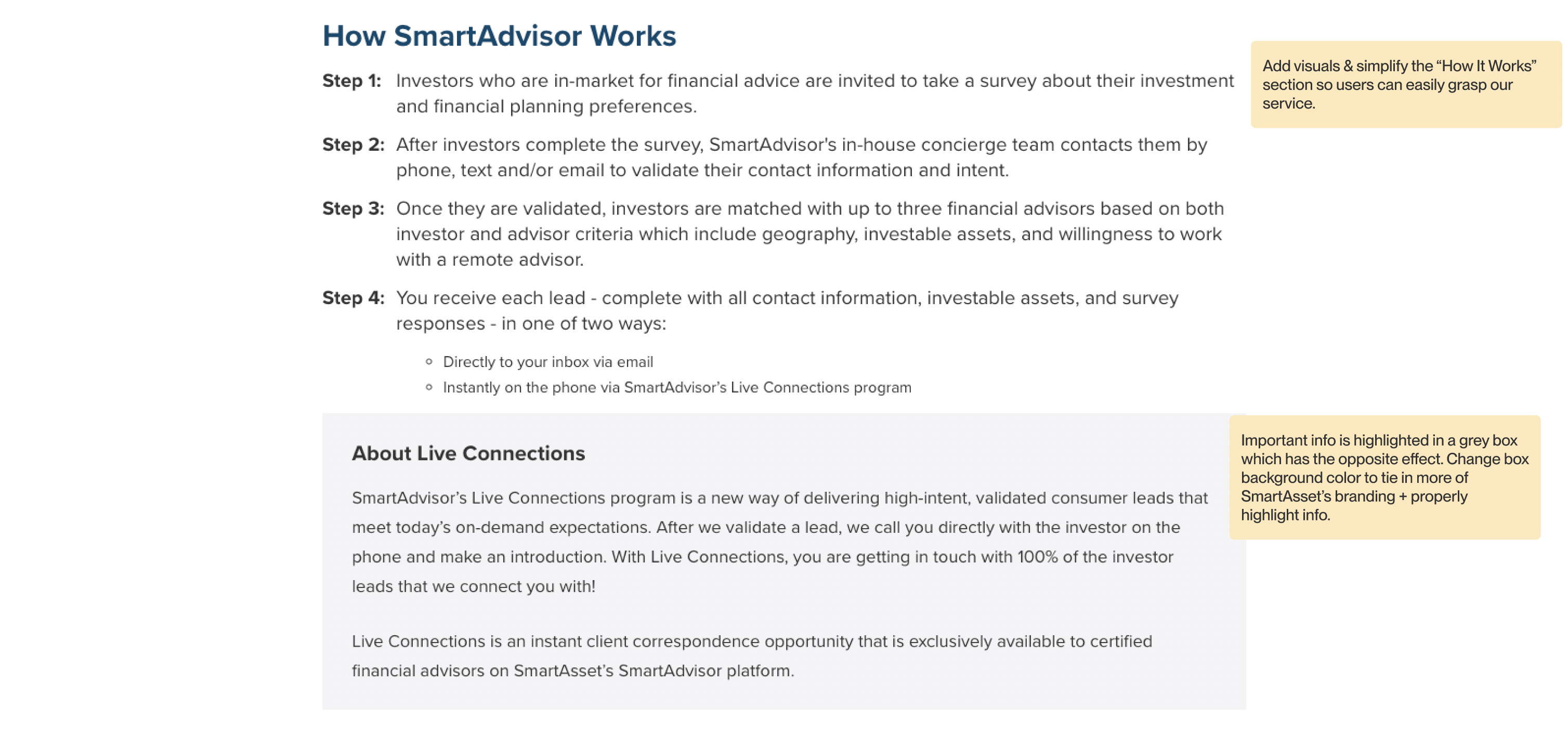
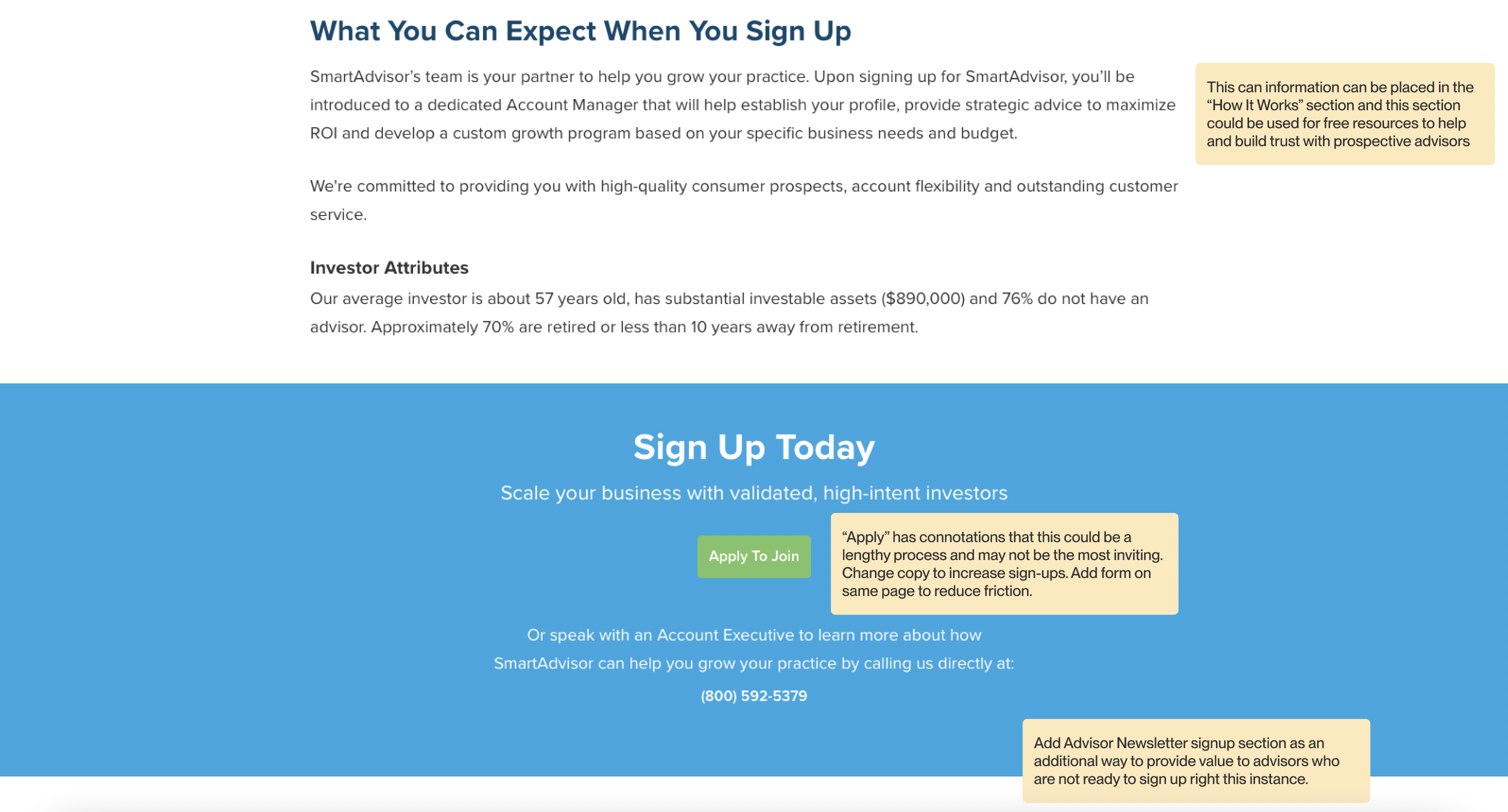
Screenshots of notes from my UX audit of the original SmartAdvisor about page
DESIGN EXPLORATION
Re-Imagining the SmartAdvisor About Page
After conducting user research and identifying the areas of improvement, I began to ideate and wireframe what the new about page would look like. I experimented with the layout and organization of the content as well as the design treatment of the different UI elements. It was important to breathe life into this page while still maintaining the professional and credible tone from the original page.
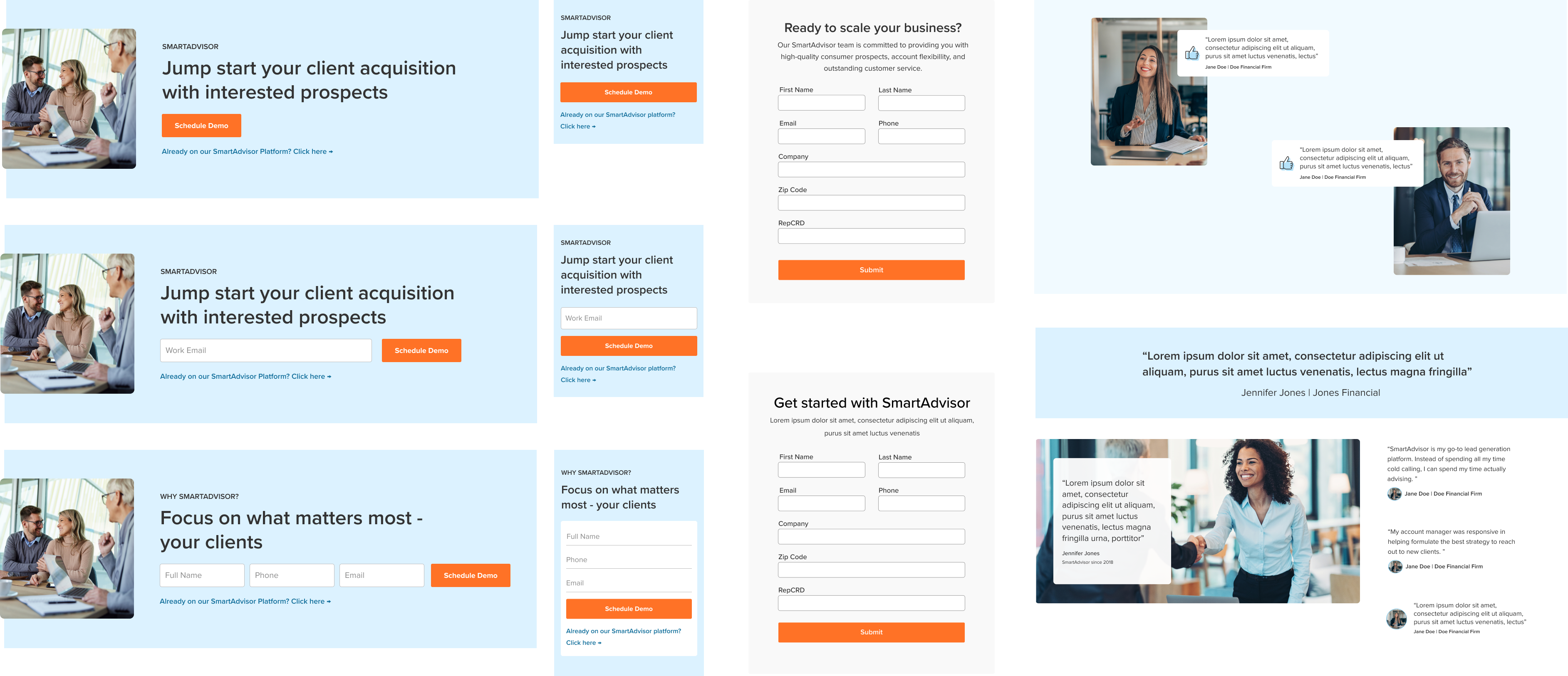

FINAL
Final Deliverable
Desktop View
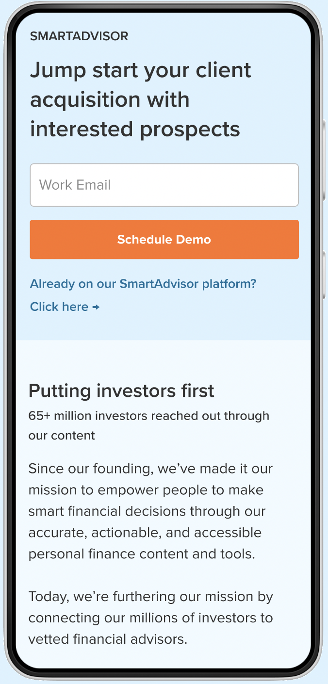
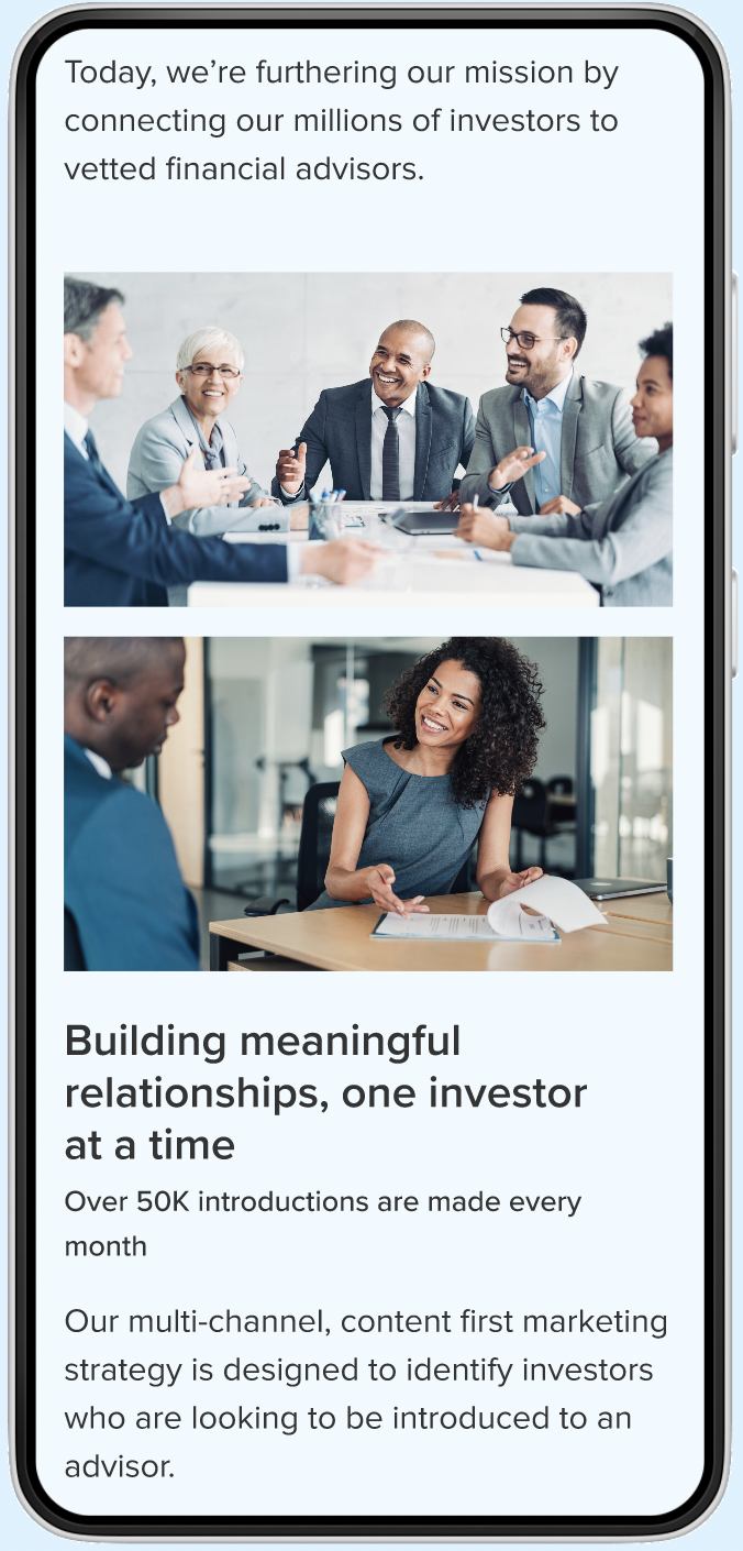
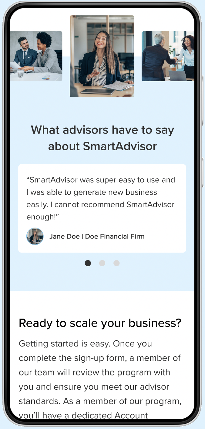
Mobile View
FUTURE ROADMAP
Next Steps
Given our time and resource constraints, our team opted for a live release A/B test to measure the success of the redesign. With lower-than-expected page traffic, we were unable to obtain conclusive results on the performance of the redesigned page and additional sections. If I had more time, I would conduct usability tests with a small sample of financial advisors to validate how effective the redesign and new sections are and iterate accordingly.
REFLECTION
Key Learnings
This was the first webpage I was able to overhaul and redesign completely during my time at SmartAsset. Through this project, I was able to challenge and stretch myself and my visual design skills. I am eternally grateful for the trust my team placed in me to execute my vision of what an improved page could look like.
If I had more time, I would conduct user interviews and usability tests with financial advisors on and off the SmartAdvisor program. Since they are the target demographic, their feedback is crucial for validating my hypotheses and ensuring that this page becomes the one-stop shop it aims to be.
Let's get in touch!