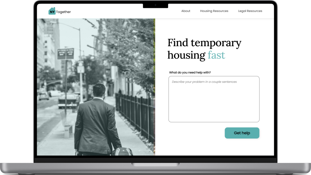
NYTogether
A web platform that aids recently evicted people navigate their way back into a safe, permanent homes
The Overview
For the TechTogether NY hackathon, my team and I decided to tackle one of New York's most pressing socioecomic issues: the eviction crisis.
With their Eviction Moratorium expiring on January 15, 2022, New Yorkers who cannot make up their rent payments in full risk eviction and homelessness.
PROBLEM
The Need
How might we help recently evicted people navigate the eviction process?
SITE PREVIEW
A Quick Look
An all-in-one website where people can find easy to understand resources tailored to their housing situation and search for affordable temporary housing. Here's a quick look of our site's core experiences. Scroll down more a more in-depth look at our process.
Natural language processing
Users type out their housing situation, and our site will process their statement and support them with relevant information. This creates a personalized experience for the user.
Easy to understand resources
Based on the user's specific housing situation, NYTogether will share relevant resources that breaks down complex legal jargon into laymen's terms and give actionable next steps.
Temporary housing search
Instead of sifting through multiple sites to find temporary housing that fits their needs and budgets, users can use NYTogether to search for housing that has assessed beforehand to ensure their search results are most relevant.
Now, let's talk process!
KICKOFF
Defining our North Star
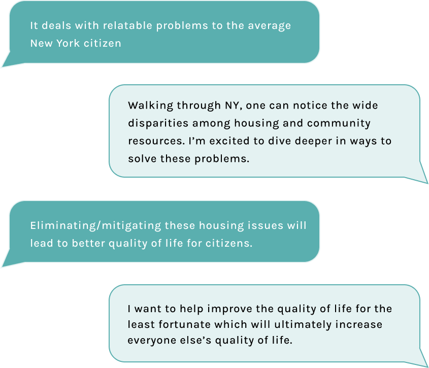
Before jumping into the fun, adrenaline inducing parts of competing in my first hackathon, my team and I needed to get clear about what socioeconomic problem we wanted to tackle and why.
We completed a series of reflective brainstorming activities to identify and solidify our North Star for this hackathon.
We decided to address New York's eviction crisis because of its relevancy, the large number of people impacted by it, and the potential for scalability across cities in the US.
USER RESEARCH
Empathizing with the User
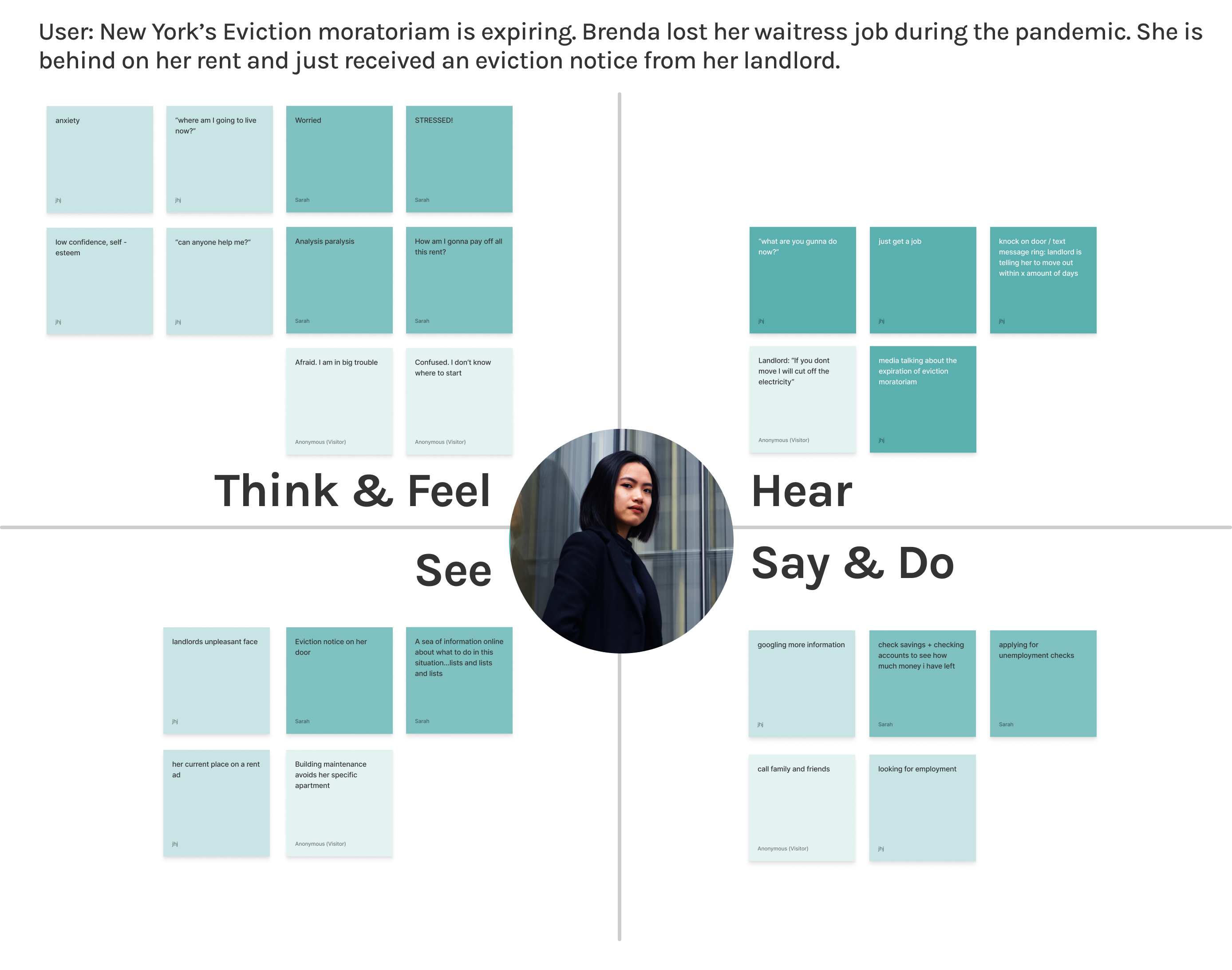
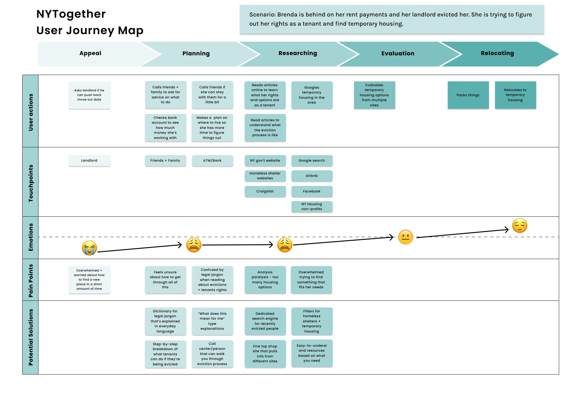
Since it was difficult to find and interview recently evicted New Yorkers on such short notice, we did the next best thing: immerse ourselves in everything regarding the eviction crisis and understand who's most at risk of being evicted. We poured over countless articles, and created an empathy and user journey map to further empathize with our potential users. Here's what we learned:
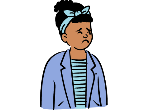
Getting evicted is scary and you don't have the luxury of time
You have a minimum of 2 weeks to vacate your unit + find a new place
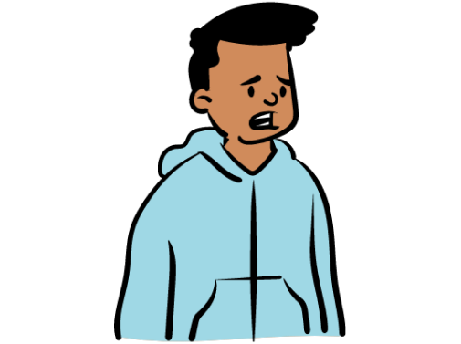
There are so many sites & resources to sift through to find temporary housing
It's hard to discern what is safe + legitimate

Getting low-income gov't housing can take anywhere between 2-10 months
And that's IF you qualify!
DEFINE
Defining the Problem
Based on the fears and needs that surfaced during our research, we created a user persona, Brenda, to act as an anchor throughout the entire design process. Brenda recently lost her waitressing job during the pandemic. Without her consistent income and government assistance, she fell behind on her rent payments and is being evicted by her landlord.
Brenda reflects the reality that many New Yorkers face. By putting ourselves in her shoes to understand her challenges, we identified the problem we wanted to solve:
How might we help recently evicted people
navigate the eviction process?
DESIGN EXPLORATION
Ideating & Wireframing
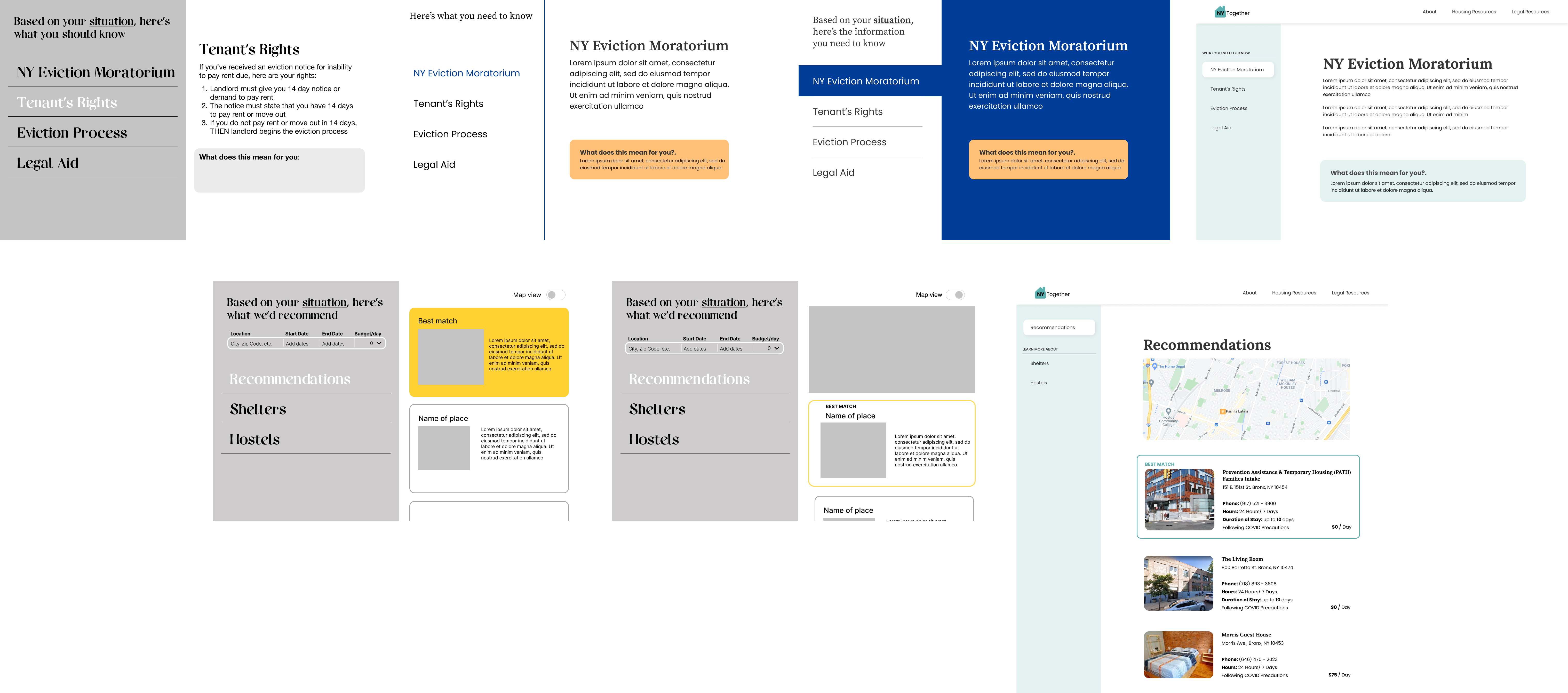
To figure out what the best solution would be, we started with 4 guiding HMW statements and brainstormed ideas for each. Afterwards, we evaluated the solutions based on whether they could solve the challenges at hand, be built in a weekend, and how well it take into account our persona's emotions and housing situation.
Our solution is a web platform where users can type out their exact housing situation and get personalized, easy-to-understand resources to guide them through the eviction process and find safe, temporary housing.
With our solution, our developers explained the backend logic and technical constraints for each page we needed to design. Below are some of our design explorations for the NYTogether web platform.


BRANDING
Discovering NYTogether's Voice
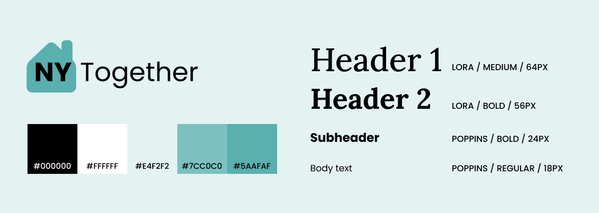
The name NYTogether is inspired by the spirit and the resilience of New Yorkers. With evictions being such a scary and overwhelming experience, we wanted our users to feel feel seen and supported through the entire process. We chose shades of teal for our color palette because it portrays calmness, and kept the typography simple to focus on aiding our users.
FINAL DELIVERABLE
Meet NYTogether
FUTURE ROADMAP
Next Steps
Due to time constraints, our team was only able to focus on key features and flows. If I had more time, I would:
- Conduct usability tests to ensure to validate and iterate on main tasks flows
- Enhance the conversational aspect of each step of the user flow
REFLECTION
Key Learnings
Although we did not win, it was still a great learning experience to work with developers and design with such strict time and technical constraints. It also felt really gratifying to use my design skills and collaborate with my teammates on such a pressing socioeconomic issue. It's a further reminder how powerful design is.
For future hackathons, I would make sure to manage our time better. Some tasks took way longer and anticipated and the lack of sleep seriously impacted us all as we were approaching the deadline. I would also prioritize usability testing. Although we finished with a prototype, we weren't able to validate our main task flow. Overall, it was a great experience and I'm grateful for the friends I made during this hackathon. 11/10 would compete again.
Let's get in touch!