J.P. Morgan Chase
Adding a goals setting and automated savings features to J.P. Morgan Chase's mobile app
CLIENT
J.P. Morgan Chase
(Solo Spec Project)
TIMELINE
Feb 2021 - Mar 2021
80+ Hours
SKILLS
UX Research
UX Design
UI Design
TOOLS
Figma
Miro
Background
J.P. Morgan Chase is one of the largest banks in the U.S. and while they do have a mobile app, it is very basic in functionality. As mobile bank usage increases, Chase recognizes the importance improving their tools to better serve their customers.
This case study focuses on my design process for desiging a a personal management finance feature to embed in their mobile banking app.
PROBLEM
The Need
How might we help users gain confidence and peace of mind in tackling their financial goals?
FEATURE PREVIEW
A Sneak Peek
Goal setting and savings features where users can set goals and get personalized recommendations based on their income and spending habits.
Here’s a look at some of the new features for the Chase Bank mobile app. For a more in-depth understanding of my design process, scroll down!
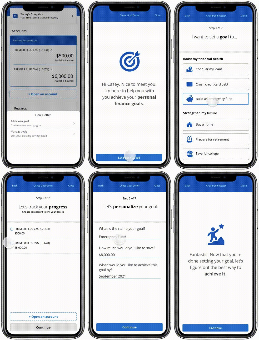
Setting Financial Goals
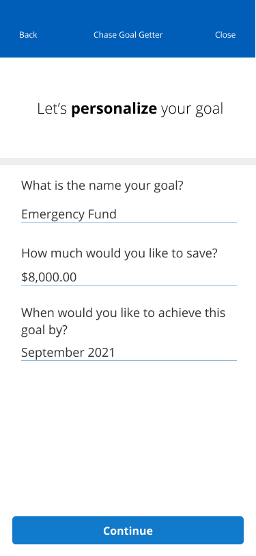
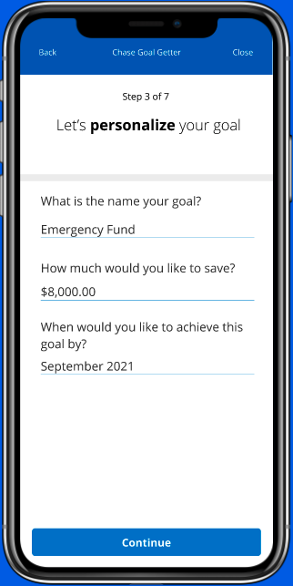
Whether it's building an emergency fund or saving for a trip, users can set specific financial goals, the target amount and date they'd like to achieve their goals by.
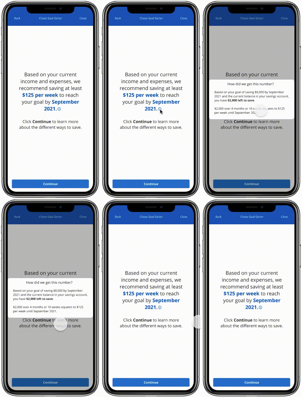
Smart Contribution Recs
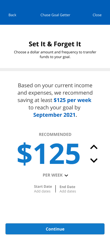
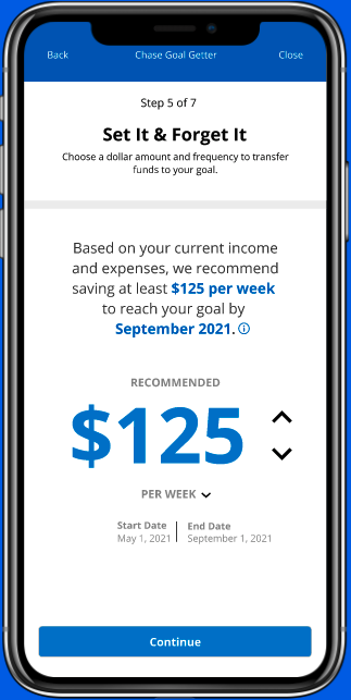
Chase recommends contribution amounts based on the user's income and spending habits. As their income and/or spending habits change (because life happens), so do the recommendations. This ensures that users are able to hit their goals without going above their means.
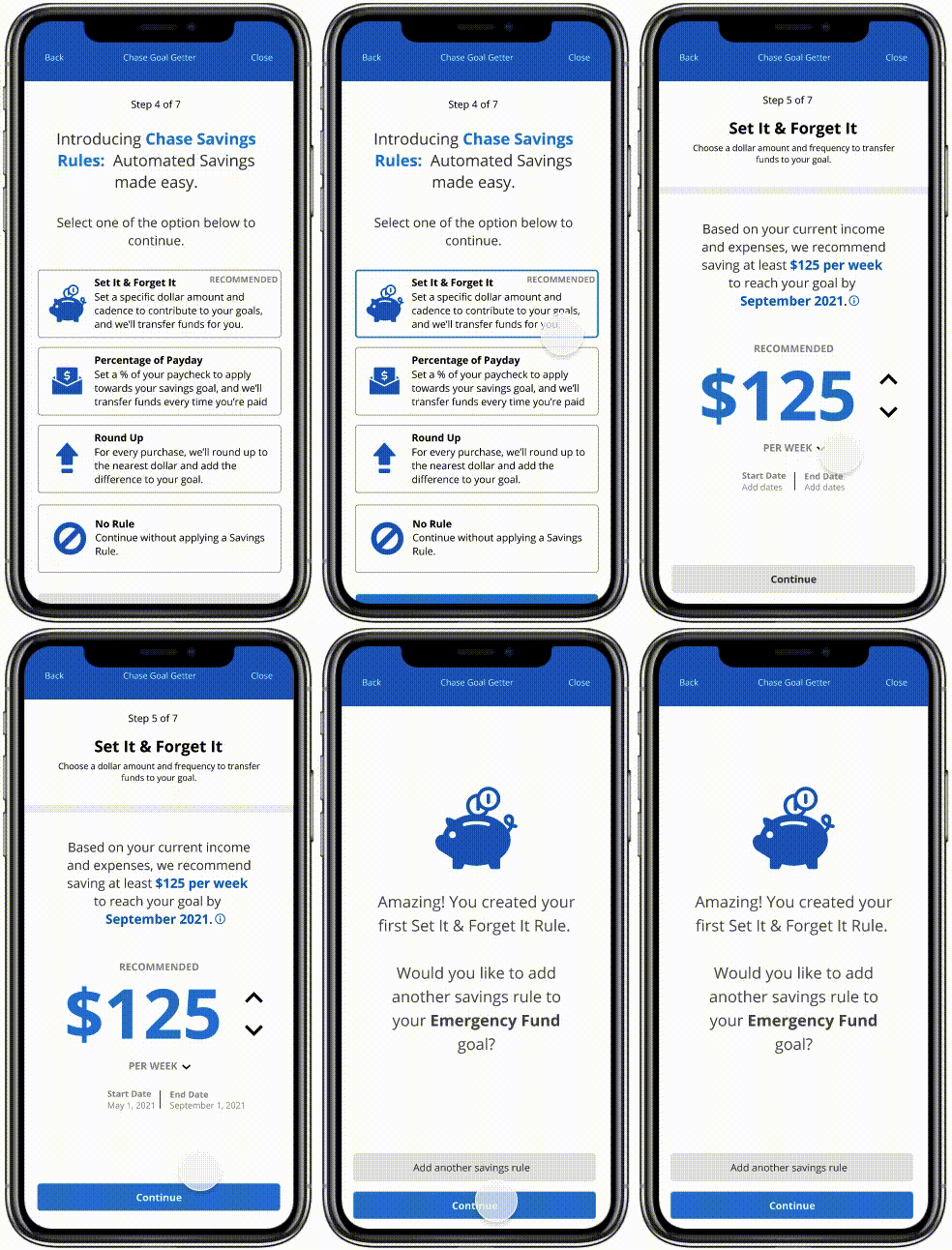
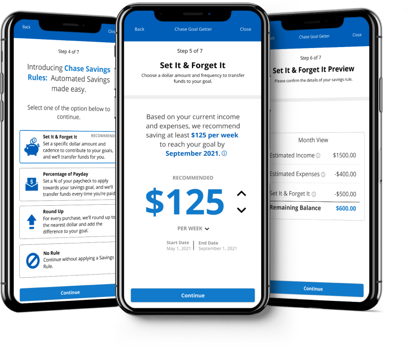
Savings Rules
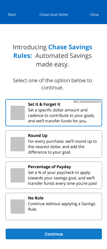
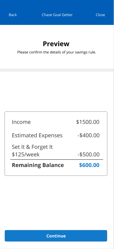
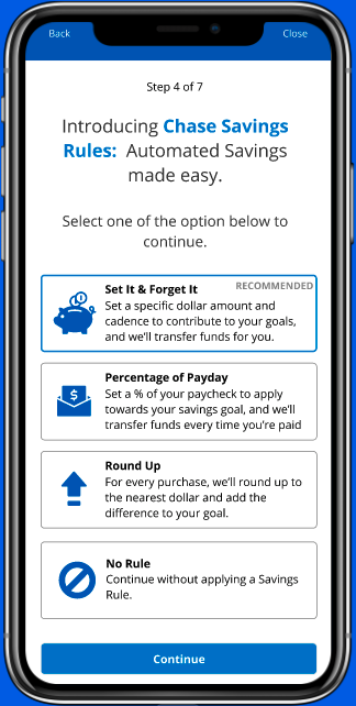
Users can apply savings rules to automate their savings. These rules take the stress out of savings because everything is happening in the back-end.
Now, let's talk process!
KICKOFF
Initial Assumptions
To kick off my design process, I listed out my initial assumptions on people's personal finance habits and philosophy. This allowed me to have a clear starting point on what I wanted to learn during my research.
01.
People want to be in control of their finances by knowing exactly how much they make, where it's going, and how much to spend/save.
02.
Money is a means to an end and is used to reach certain goals.
03.
Millennials and Gen Z use financial apps more than those from previous generations out of convenience.
USER RESEARCH
Understanding Chase's Users
Analyzing the Competitive Landscape
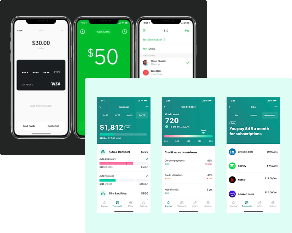
Afterwards, I scoped out the competition to see how other banks and FinTech companies were helping their customers manage their finances and achieve their money goals.
Conducting User Interviews & Surveys
To round out my research, I conducted user interviews and surveys to learn what people's money goals are and how they managed their finances. I interviewed 3 participants between the ages 24 - 52, and received 15 survey responses from people between the ages of 22-40.
User Interviews Insights
Budgeting & spending are centered around specific money goals
With multiple goals, people will prioritize based on their current financial situation
People are looking out for their future selves & want peace of mind via financial security
Survey Insights
66.67%
of participants stated that they're current money goal is to build an emergency fund
86.67%
of participants utilize multiple methods & apps to accomplish their money goals
66.67%
of participants utilize their banking app to manage their income
DEFINE
Defining the Primary User
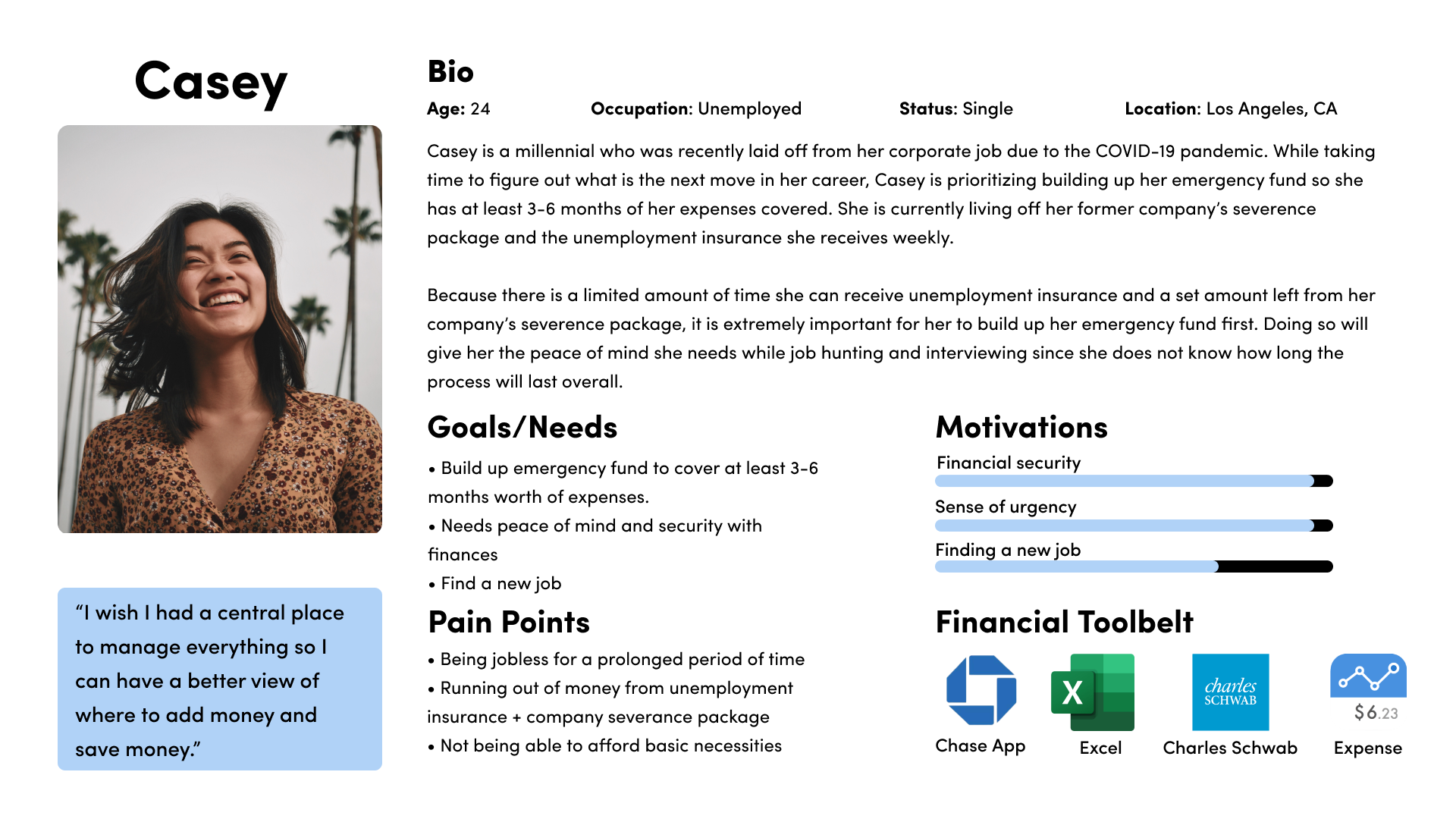
Based on my research, my user persona encompasses someone who lost their job during the pandemic and has to pivot to stay afloat during these stressful and uncertain times. Meet Casey, a recently unemployed millennial from Los Angeles, CA. While taking time to figure out her next career move, she's prioritizing building up her emergency fund to cover 3-6 months worth of expenses. Understanding who Casey is and what gives her peace of mind allowed me to design a solution she'd actually use.
User Flow
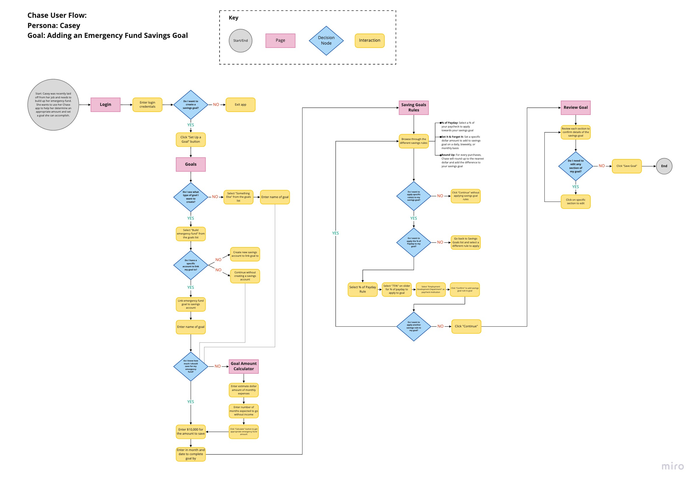
Afterwards, I created a user flow to show the multiple ways users can set financial goals and apply the different savings rules. It was important to show how they can also play around with numbers and what the outcome would be so users feel confident with their contribution amount and a plan to achieve their goals.
DESIGN EXPLORATION
Ideation & Wireframing
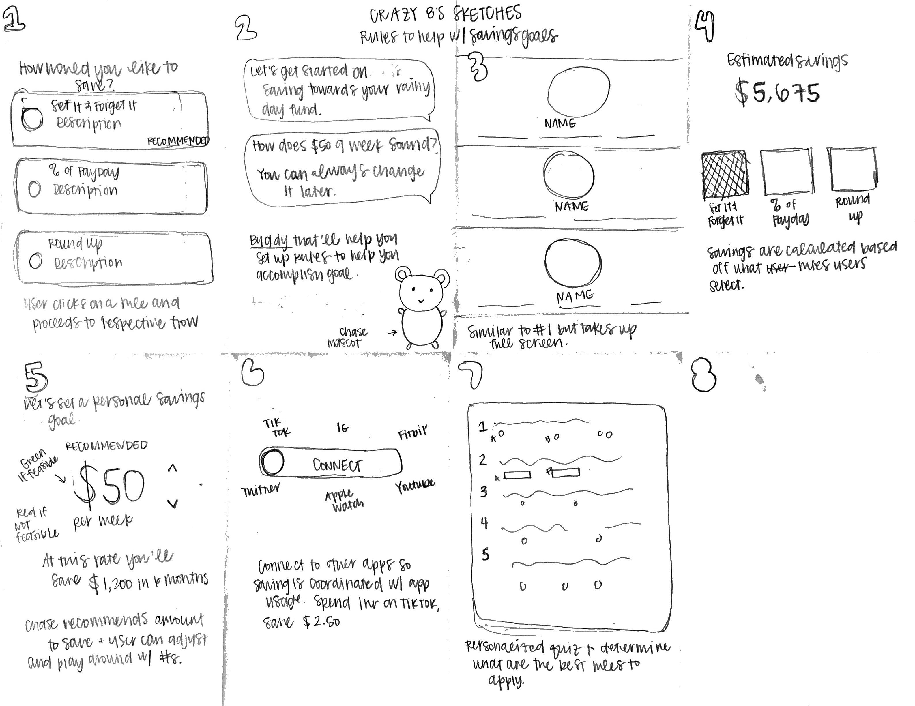
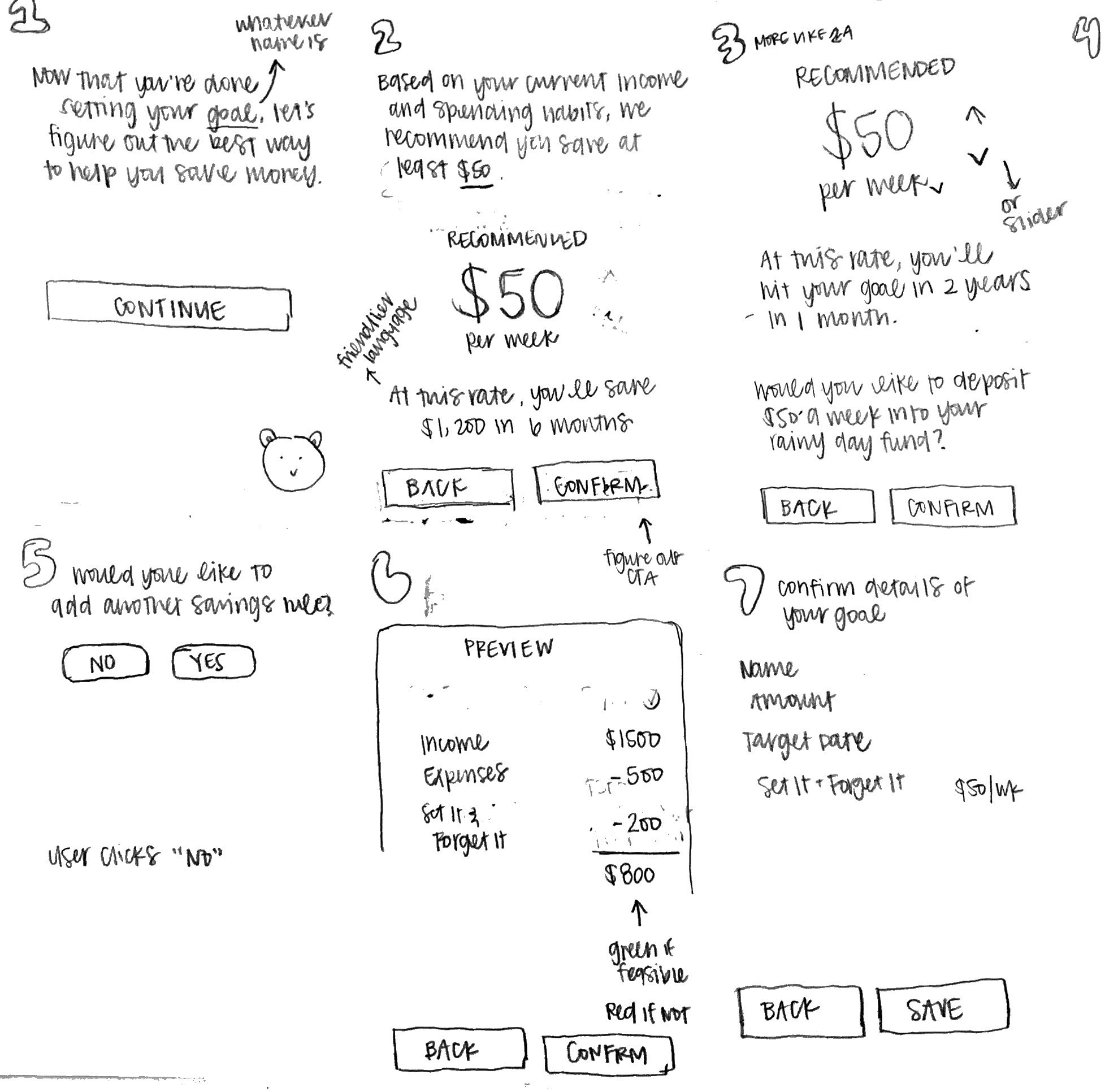
I did a Crazy 8’s sketch exercise to brainstorm ways to help people save towards their money goals. When choosing which solution(s) to move forward with, I evaluated each based on how well it balances the approachability and practicality of saving. If the solution was too confusing or took to many steps, it was no longer a contender. I went with sketches #3, #4, and #5 and sketched out what the flow might look like. Afterwards, I began building out my mid-fidelity wireframes of my detailed sketches and adding different interactive elements that are representative of the look and feel of the Chase app.
MID-FI WIREFRAMES
USABILITY TESTS
Testing My Assumptions
I conducted remote usability tests via Zoom with 3 individuals in the 19-26 age range. All participants have have experience with mobile banking. During the usability tests, I asked each participant to create an emergency fund savings goal and add savings rules to that goal. While completing each task, participants were asked to talk me through the feelings and thought process.
Success
01.
100% of participants were successful in creating an Emergency Fund savings goals
02.
100% of participants found the goals setting feature helpful
03.
The standout feature was the addition of different Savings Rules.
Pain Points
01.
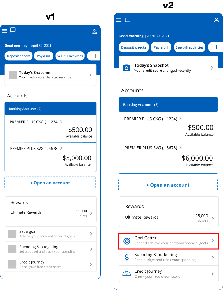
Finding the goal setting feature was tricky and not obvious
02.
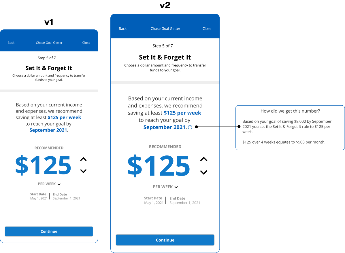
Whenever numbers were displayed, participants wanted to know how the numbers were calculated and how it impacted their finances.
ITERATION
The Refinement Process
Based on the feedback I received from my usability test, I made the following changes to the prototype.
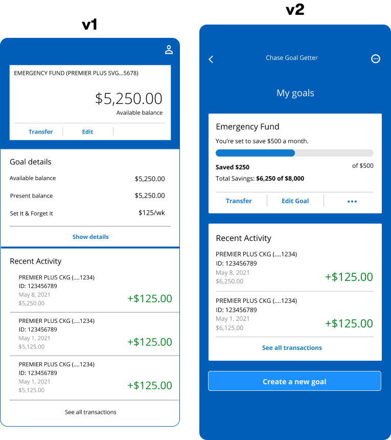
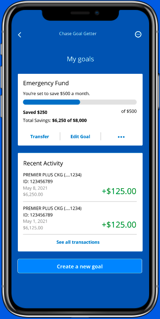
Distinct UI for goals page
In V1: Since the UI between the goals page and checkings/savings account page were nearly identical, users were confused by where to access the goals setting features.
In V2: Changing the UI of the goals page allowed users to learn that there are different places to access your goals and that it functions differently from other pages.
FINAL
Final Deliverable
REFLECTION
Key Learnings
Break it down now!
When designing the automated savings feature, I thought showing the amount users should save sufficed. However, through my usability tests, I learned that that wasn't the case at all. When users were presented with any kind of numbers, they wanted to clearly see the how the numbers were calculated and make the final call themselves. It never hurts to break things down further because users will get all the information they need which will in turn help them make the best decision for themselves.
If I had more time...
I would build out a flow that shows how the app can help when users can't consistently contribute to their financial goals. While my prototype illustrates the most ideal situation, it's equally important to show that life happens and that the app is equipped to help get users back on track without hurting their current financial situation.
Let's get in touch!
