
SMARTASSET
Advertorial Landing Page
Redesign
Generated $225K in monthly revenue uplift by rebranding and optimizing the UX of high-traffic advertorial landing pages
TEAM
Kyrsten G., UX Researcher,
Frontend Developer
ROLE
Ideation
End-to-End Prototyping
TIMELINE
June 2022
TOOLS
Figma
Optimizely
Overview
SmartAsset's Marketing team utilizes advertorials to inform users on different personal finance and retirement topics as a means to direct users to the Investor Funnel, the primary product to match consumers with financial advisors. While they receive a lot of user traffic, the conversion rate has stagnated over time.
I was tasked with redesigning the "7 Mistakes When Choosing a Financial Advisor" advertorial landing page to achieve the following goals:
- Increase conversion rate to the Investor Funnel, SmartAsset's advisor matching service, by 5%.
- Improve the overall usability.
- Align advertorial landing page with SmartAsset's updated branding guidelines.
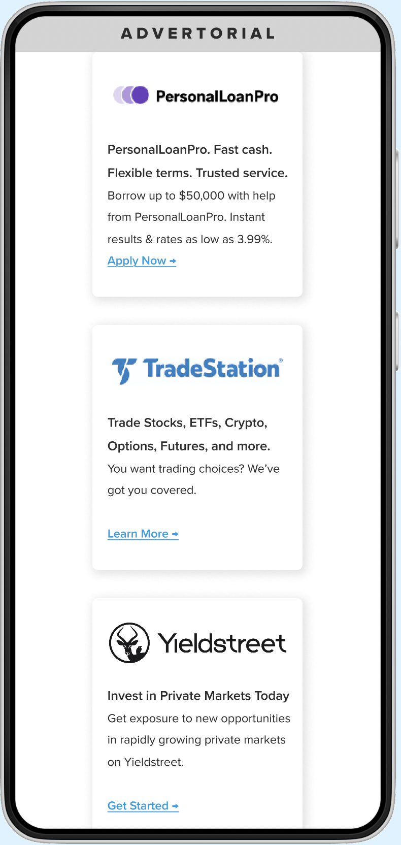
👋 Say hello to the newly redesigned Advertorial Landing Page!
The redesigned Advertorial Landing Page features updated branding and typography that truly allows the content to shine and capture the reader's attention.
Here's a snapshot of the desktop version. Scroll down for a more in-depth look at my process.
Now, let's talk process!
Research Approach
Before diving into redesigning the advertorial, I first met with our UX Researcher, Kyrsten, to understand who the target user of these pages were and their overall goals. Afterwards I completed a competitive analysis to explore how our direct competitors structured their content rich blog posts and articles.
Finally, after the designs were completed, I conducted A/B tests via Optimizely to measure how the redesign performed against the original advertorial template.
Competitive Analysis Takeaways
TAKEAWAY 01
Relevant and compelling content to inform, persuade, and motivate users to take action.
TAKEAWAY 02
Strategic placement of CTAs is crucial to encourage user engagement and make it easier to take next steps.
TAKEAWAY 03
Minimal distractions to avoid diverting the user's attention away from engaging with the CTA.
Identifying Areas of Improvement
Following my competitive analysis, I dove into a thorough UX assessment of advertorial. The goal of this assessment was to pinpoint areas that needed serious improvement.
Here's what I found:
- Lack of Visual Cohesion: The typography and visual elements vary from section to section which disrupts the overall visual harmony of the page and distract readers in the process.
- Poor Page Organization: The current advertorial lacks a clear and logical flow of information. This can make it difficult for users to navigate the page and disrupt their mental model of this page.
- Inconsistent Branding: By not adhering to the established branding guidelines, it’s hard to tell that this is a SmartAsset landing page which in turns decreases brand awareness efforts.
Scroll to read notes from my UX assessment of the original "7 Mistakes" Advertorial Landing Page
Reimainging SmartAsset's Advertorial Landing Page
Taking into account my research takeaways and UX assessment, the new advertorial features the following updates:
Improved cohesiveness and readability by establishing consistent typography and spacing throughout the entire designer
Enhanced the visibility of CTAs by strategically and contextually integrating them into the content.
Created a more logical flow by re-organizing the page sections and elements
Increased brand awareness by aligning to SmartAsset's latest brand guidelines and incorporating UI elements from other SmartAsset products.
Desktop View
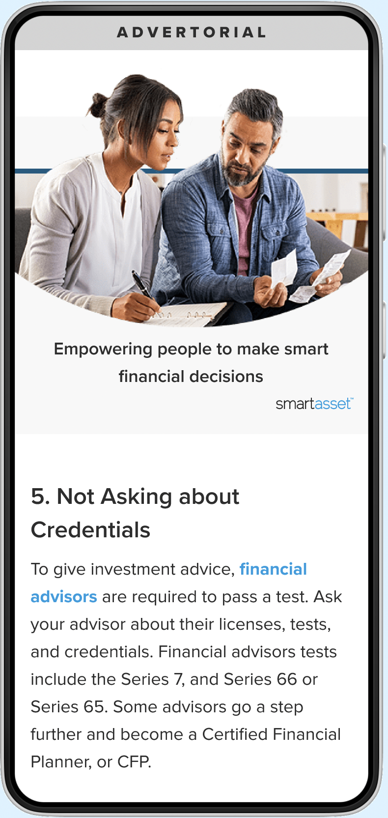
Mobile View

Results
The implemented changes yielded significant outcomes. Here are the most notable achievements:
- Increased funnel conversion rate by 7%
- Generated $225K in monthly revenue uplift
- Utilized this redesign as a template for 6 other high-traffic advertorial landing pages
Reflections and Learnings
Less is more
Sometimes the best solution is the simplest one. By focusing on establishing consistent typography and spacing and eliminating unnecessary elements, we were able to redesign the page in a way that is more user-friendly and allows key information and CTAs to stand out.
Balancing user and business goals
This project provided a valuable opportunity for me to enhance my skills in balancing both user and business goals. By deeply understanding the target user and consistently considering their needs during the design process, while also keeping business objectives in mind, I successfully created a design that effectively satisfies both parties.